

Bernie Fuchs (1932-2009) was an illustrator who started his career at the New Center Studios in Detroit where he worked on a series of car advertisements. After a successful stint in Detroit he moved to Westport, Connecticut and started a freelance career that immediately made an impact. I’ve heard that one of his illustrations caused a fellow professional to proclaim: “The business will never be the same again”.
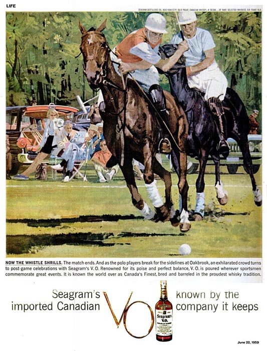
Fuchs worked for the major magazines of the time, which included: Good Housekeeping, McCalls, Cosmopolitan, Sports Illustrated and many others. He also did advertisements for Coca-Cola, Seagrams, and Zenith. In 1975 he was the youngest artist to be elected to the Society of Illustrators Hall of Fame.
In the 1960’s he had this to say about the illustration business: “When I got out of art school there was a great aura of glamour surrounding the top illustrators. No more. There are very few illustrators today that all the kids know about. Nobody new has come up with a style and made it stick for ten years as once he might have.
Present-day illustration, too, has changed, moved forward, since the so-called golden era of illustration. Illustration will always have a long way to go, and while now there is less of it around to do, at least it’s doing a better job, in my opinion.
The greatest thing that this whole business has done in the last ten years is to introduce variety, not only in the freedom of the illustrators and in the fresh ways that illustration can be done, but also in opening up new sources of assignments. Added to story and advertising illustration are the new reportorial projects like those initiated by Fortune, Sports Illustrated, Esquire, Holiday and Look. Several magazines are experimenting with art in other ways. Even articles on food have been handsomely illustrated by still life paintings in Redbook and McCalls.
If you are “with” your own times and can translate your ideas into valid, original pictures, then you can make your own contribution. The field has never been so fast-changing and unpredictable as in the ‘sixties – or so demanding of the illustrator’s mind as well as his brush.”
His comments are interesting because they describe the transition that illustration was going through at that time and, in many ways, they mirror the business today. I don’t see many reportorial assignments, but I do see a variety in both artistic technique and how images are used. For example, an illustrator today might work in a realistic oil painting technique while another artist uses a digital style that’s almost abstract. The internet also gave new outlets for visuals, but one that artists are still trying to figure out (as well as magazines and newspapers).
Bernie Fuchs saw the new direction in illustration and, in turn, changed his own approach to painting. He no longer worked with the acrylic technique that he was known for and now used a light oil wash (which he did until his death in 2009). Here’s a sample of each technique.
Acrylic:
Oil Wash:
Instead of sharing his well known work, I thought it would be fun to discuss a few pieces that give a behind-the-scenes look into his process. This includes paintings that are similar to the final illustration, but didn’t make the cut, and color sketches that gave his clients a variety to choose from. There are times when I find that I prefer these pieces because of the unfinished quality and energy that’s in them.
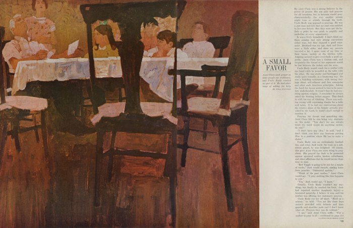
Here are three color studies done for an article titled “A Small Favor” in the November 1965 issue of McCall’s Magazine. The images are loose, but give enough detail so that you know what his final composition will look like.


Below you’ll find the final printed page.
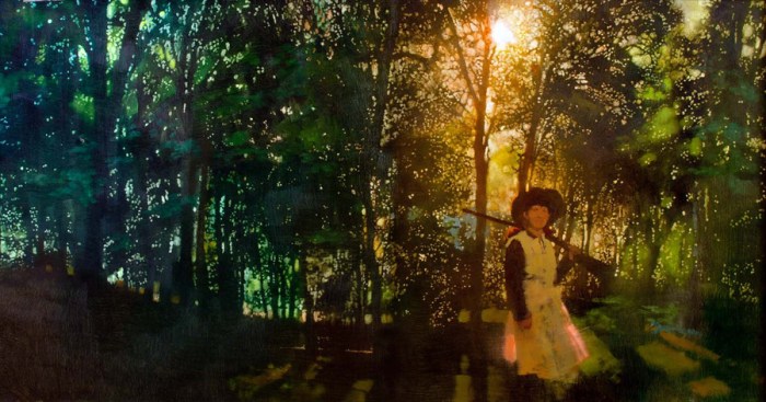
For the November 1961 issue of Good Housekeeping Magazine he did this color sketch of a woman in an outdoor café. Next to it is the final illustration. This makes me wonder: Did he show his client drawings that were later approved? Or did he basically do two finishes and let them decide?


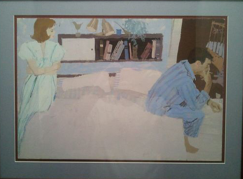
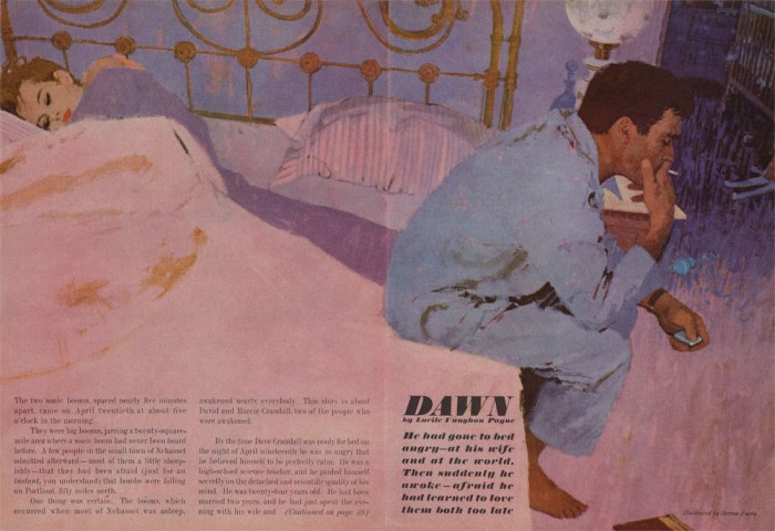
Fuchs used a similar approach for the December 1960 issue of Redbook Magazine. It’s a scene of a couple in their bedroom; Illustrations A, B, and C. Anyone of these pieces could print as the final and nobody would question it.
A:

B:
C:
Let’s take a look at the differences in each one:
In Illustration A, the two figures are farther apart than what he used in the final piece (C). He also changed the background by adding in a bookshelf on the wall, a different lamp near the man, a pattern on the wall, and a children’s stuffed animal on the floor. The back room is obscured with a blue color technique and the man’s pose has him lighting his cigarette instead of holding a lighter.
In the second image (B), he gave the woman a pose where her arms are folded while looking directly at the man. This piece has the same bookshelf, but the background is no longer angled like the other two. He also added a crib in the other room and changed the toys on the ground. The pose of the man is new, when compared to Illustration A, and it’s what he later used in the final (C). My guess is that he thought it worked best because it does a better job of showing him in thought. The focus is no longer on lighting the cigarette and instead he’s taking a drag from it.
For the final piece (Illustration C) he used elements from the two previous images. The background is angled, the woman is sleeping (but closer to the man than in Illustration A), and he added a headboard along with a different lamp. The toys on the ground changed again, but he kept the child’s crib. The angled headboard/bed helps lead your eye from the woman to the man. Her pose also shows a different emotion than in image B (where her arms are crossed).
Personally I like all three pieces for different reasons and think every change he made was in service to the story.
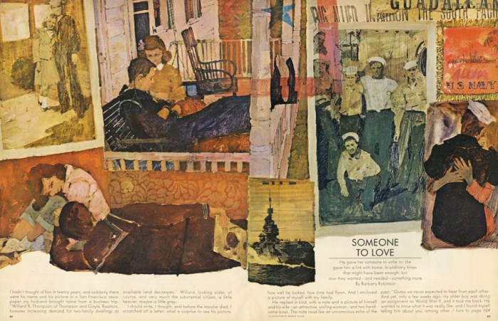
I’ll end with this original. I don’t have any sketches for it, but thought it was interesting because of what they cropped out in the final layout.


I’d like to thank John Paul Leon for providing a photograph of the framed Fuchs painting (Redbook December 1960). To see JP’s own artwork please visit: www.johnpaulleon.com
I’d also like to thank Matt Dicke for providing images for this post. To see more artwork by Bernie Fuchs please visit Matt’s flickr page:
https://www.flickr.com/photos/13495387@N00/sets/72157625369781729/
The quote from Bernie Fuchs, about the 1960’s illustration business, is from the book “The Illustrator in America, 1880-1980” by Walt Reed.


I have his illustration program that he did his first show in Detroit Michigan . In 1962 . This is a very rare piece. That shows his geniusness in his artwork.