
Bruno Paul (1874-1968) was an architect, interior designer, educator and illustrator. His contributions to Simplicissimus (1897-1906) gained him international acclaim and, according to one historian, served as a visual manifesto for the magazine*. It also gave Simplicissimus its first characteristic style and individual artistic merit. He had quite an impact on the magazine, especially for someone who only worked there for a limited time (I know 9 years is a long time, but in comparison Eduard Thony contributed illustrations to Simplicissimus for 48 years!).
After Simplicissimus he became director of the art school of the Berlin Museum of Applied Art and went on to work as an architect and interior designer. However, for for the purpose of this article, I’d like to focus on his illustration work.
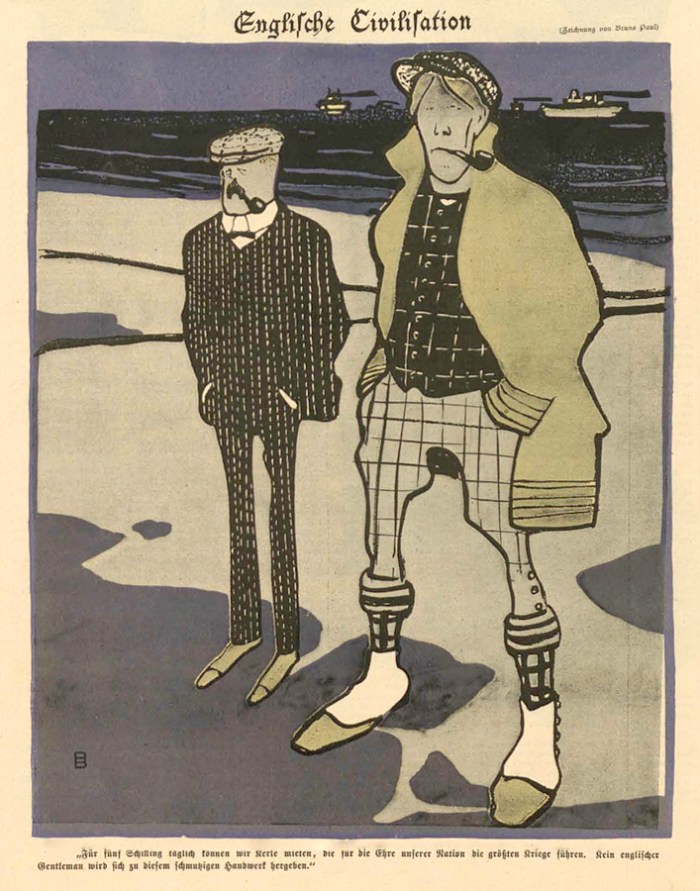
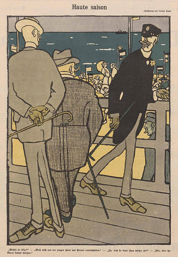
As I discovered Simplicissimus Magazine, and gradually became more familiar with its artists, Bruno Paul’s work stood out. The first thing that struck me was the “character types” in his art. For example, look at the two men in the sample below. To me, they look like “Sherlock Holmes” era detectives investigating something that happened on a beach. I can’t read the German text, but I already get a sense of a story just by the way those two men are drawn.
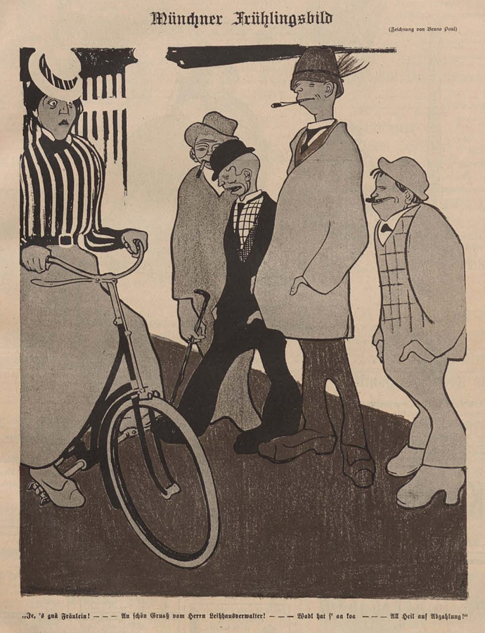
At times Paul gave his character’s facial expressions that were lively and added to the story he was telling. The piece below shows a woman with a worried look on her face while she rides her bike past a group of men. The expressions on their face makes me think that they’re up to no good. Three of the men are looking at her (while smoking) and one is smiling.
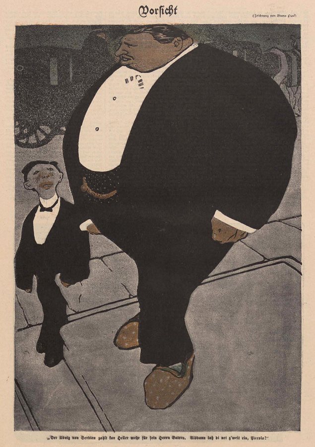
In this next illustration it shows the variety that Paul drew with his characters. It’s a bit extreme, but I think it gets my point across. One man is drawn as a big round shape while the other figure is tiny and thin. The difference in the two provides the viewer with a variety of visual interest.
Paul also worked well with color and the end result reminds me of lithography. My guess is that he worked closely with a skilled printer much in the same way that Thony and other Simplicissimus artists did. In this illustration the bright yellow color (the beach) makes the figures stand out (who are colored with a muted grey). He also added a slight yellow/brown color on the men’s shoes and gloves. That color, plus the green on the middle mans shoes, helps lead your eye around the image.
For this illustration he used two colors (three if you include “black”) and he strategically placed it in the image. If you look at what he left white you’ll noticed that it leads your eye throughout the composition. The jars/bottles at the bottom, up to the cuffs on the man, then back to the paper and up to the delivery mans hat. He uses color in a way to get the viewer to look where he wants you to look.

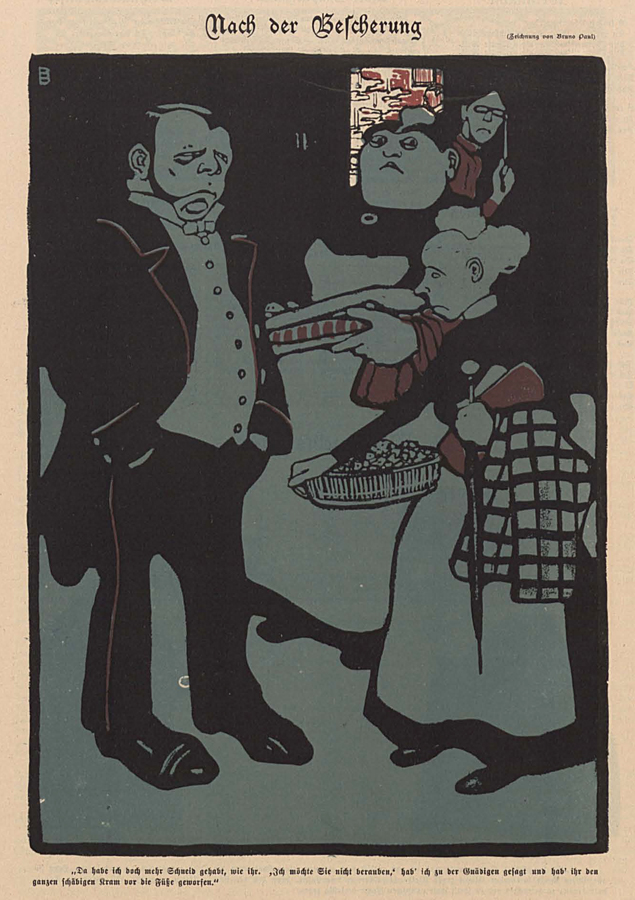
Here’s another image with an interesting use of color. The scene takes place in a room and he used one color (greenish blue) to indicate the it’s dark inside. He also leaves white in the doorway to show that it’s light outside and then adds another color (red) to lead your eye throughout the composition.
Bruno Paul is one of my favorite artists who worked for Simplicissmus and one that I think deserves greater attention. In addition to the illustrations I’ve already shared you’ll find a gallery below. In all of them he continued to push the color, shape and character in his images. Enjoy!


*From the book “Simplicissimus: 180 Satirical Drawings” by Stanley Appelbaum.


Hi Daniel, thanks for sharing this collection. The German captions set in Faktur are difficult to read, but the first one with the Sherlock Holmes gentlemen is called “English Civilisation” and says:
For five shillings a day we can hire [xxx], who wage the greatest wars for the honor of our nation. No English gentleman will stoop to this shoddy trade.
And the men at the beach is called ‘High Season’, and says:
“Where are you off to in such a hurry?” “I’ve got to say goodbye to the young woman from Berner.” “Oh, is she leaving already?” “No, but her husband is arriving tomorrow.”