This is Part 2 of a four-part series about how to get an illustration agent. In this series, I detail my top 10 recommendations for illustrators looking to find an agent. You can read Part 1 here. Be sure to follow Illustration Age on Twitter to be notified when the next part drops.
In Part 1, I argued for the need to learn about as many agencies as possible before choosing which ones to get in touch with. Next, I described the minimum requirements your body of work (portfolio) should meet. Finally, I compared the difference between style and voice and how this plays into the impression you can make on illustration agents. In today’s instalment, I examine what the qualities of a professional illustrator’s website and recommend how you can bring your own page up to the next level.
4. Have a professional, well designed online portfolio
These days, portfolios come in many different forms, but one thing is for certain: it’s all happening online. There was a time when artists would carry their portfolio from building to building, and only one or two people would look at it at a time, as the artist guided them through each project. In fact, the word portfolio literally means “folder that you can carry around”.
Could you imagine actually going to an agency’s office, riding up the elevator, portfolio in hand, wondering if you have food stuck between your teeth and whether you should have worn your glasses? Fortunately, we don’t have to go through this anymore. Maybe that’s a bad thing for social interaction, but the benefit is that our portfolio is no longer this secret, private thing that only a few people get to see. Instead, anyone can stumble upon it — and you should hope many do.

In 2019, many people might be tempted simply to have an instagram account, but I think for most people this is a mistake. First of all, we just don’t know what will become of a given social media platform down the road, and second of all, it’s noisy out there! When you have your own web portfolio, with its own URL, it’s your own stage and you don’t have to share it with anybody else. You get to show what you want, how you want, and you can say exactly what you need to say. You can also share details about your work that might be hard to share on a social platform like Instagram.

Think of it this way: as a freelancer, you are a business. You don’t have an actual shop or office (or probably not one you’d want to invite strangers into), and so in the place of such a thing, you have a website. Having a business = having a website. Have you ever tried to find a restaurant online, only to find out they only have a Yelp page? Exactly.
If you want to show agents and potential clients that you mean business, here are some important features your online portfolio needs:
Hosted on a proper website platform
If you’re not a web designer, don’t design your website from scratch. Similarly, do not host your website on a free platform. Use a well designed template on Squarespace, Wix, Cargo Collective, or WordPress if you’re feeling more adventurous. You should also know that, if you have a CC subscription, you automatically have an Adobe Portfolio website, which is just as good. Don’t mess around. Use one of the popular templates and let your work shine through. People may not notice whether you use one of the above, but they will definitely notice if you didn’t.
A custom, relevant domain name
Few people will congratulate you for using your name as your website address, but if you try something else, something a little too fancy or strange, people might judge you wrongly. I’m not saying you absolutely shouldn’t use anything other than your straight up name with a .com slapped at the end of it, but I highly recommend it. For many, your URL is the first step of the journey to discovering your work. Most illustrators go by their first and last names, and your URL should simply reflect this. If you are special and go by a moniker, such as Magoz or Andy J. Pizza, then good for you — be sure to use that as your URL instead. Like I said, it works for some people, but if it doesn’t come naturally, just go with your name.
While were talking about URLs, be sure to actually have a custom domain name. Don’t settle for a @gmail.com address. You’re trying to make the big leagues here, and big-leaguers have their own domain names.
A simple logo or wordmark
You don’t need much for a logo. It could just be your name typed in a nice font that matches your template. Or you could hand letter your name in your own lettering style. If you have a more clever and elegant logo you’re happy with, then use that! Just make sure it works with your template elegantly. If you’re not a designer and not comfortable with lettering, better to just use a good font than to try to design a clever logo. I used a straight up font for years, and it worked. More I upgraded to a custom hand-lettered wordmark, but I was only able to do this after my hand lettering style became more entwined with my voice as an illustrator.

A simple, minimal navigation structure
Have as few pages as possible with links easily accessible at the top of the page. You will have your home page, which should really just be a visual summary of your work (i.e. a page of well-chosen thumbnails for all your galleries). You should then have an about/contact page, which includes a quick bio and simple contact information (see below). Finally, if you have any links to share, whether social media or favourable press, include these in a suitable context. Social links can go in the footer of the website and/or on the contact page. Articles about your work or features in blogs and magazines (if you’re so fortunate) can be handled either on a separate page called “Press”, “Accolades”, or “Mentioned in”, or even in your About/Contact page under a heading by one of these names. Pretty simple, right? Whatever you do, do not overwhelm visitors by including many different links in your primary navigation. Make it about your work and about who makes the work. You might want to include your Etsy shop, but unless it reflects the same calibre of work you’re trying to present on your portfolio, maybe wait a bit on that.
An about/contact page (either separate or together)
A good about/contact page has minimal but highly useful information. Agents and clients alike will want to know a little bit (A LITTLE BIT) about the artist behind the work, and of course, how to get in touch with you. A good order of sections would be something like, 1) Artist bio and photo, 2) Contact info and social media links, 3) Select clients, 4) Awards. I prefer to keep About and Contact on the same page because sometimes a Contact page on its own can be rather sparse. I think people often make up for this by having an email form, which nicely fills the space and kind of looks pro, but I don’t think anybody wants to fill out a form like this when trying to get in touch with an artist. Contact forms feel impersonal, and worse, gives the sense that the message may not even be received. This is why I just include my contact information and bio info on the same page (and why I never end up reaching out to people who can only be contacted through an online form).

A clean, white background
There may have been a short period of time (perhaps 1997 – 2006) when artist portfolios could have fancy backgrounds made to look like parchment paper or maybe designed to look like a real newspaper (EXTRA! EXTRA! ILLUSTRATOR FOR HIRE!). Needless to say, there’s not a lot you need to put into the background and containing elements of your website. Pick a good portfolio template from one of the website platforms above, and keep things airy. I find that most illustration looks best on a plain white background, or something close to it. Black or charcoal might also work well sometimes, but unless you’re confident about your colour choice, stick to white. I would also avoid fancy effects like parallax scrolling and animated/kinetic feeling mouseovers, for instance. Do whatever you can to present your work as clearly as possible without distracting or annoying your viewers. You are not trying to get a web design award. Let your illustration work speak for itself and avoid the temptation to use fancy effects.

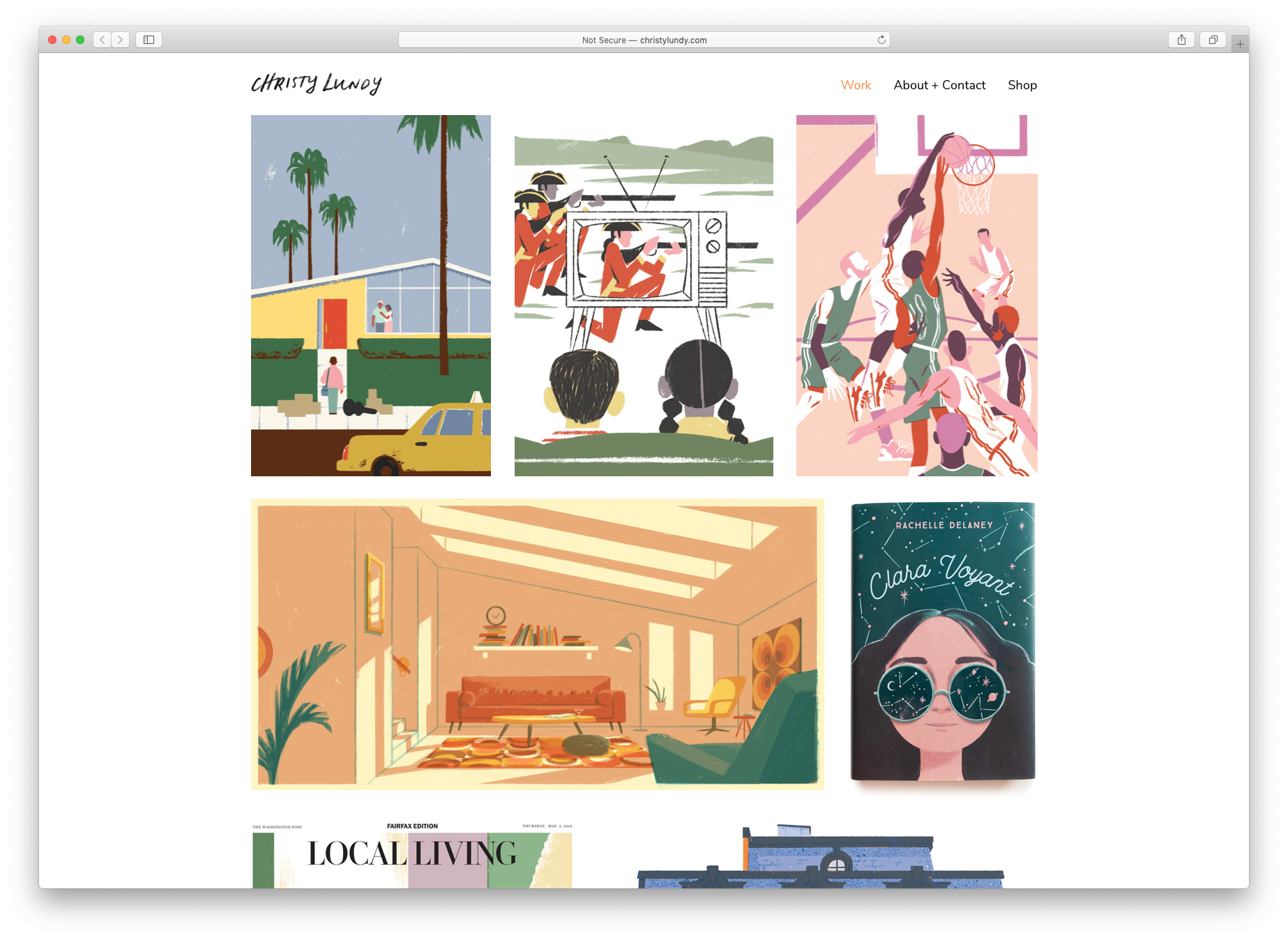
A visual summary of your body of work on the front page
I touched on this above when I wrote about having a simple navigation structure. By and large, the homepage of most top illustrators shows a page of thumbnails of their work. This is the easiest way to communicate to viewers that you have lots of work (a full and balanced body of work, professional experience) and demonstrate how it all relates to one another (voice). Clicking on one of these thumbnails should of course link into the gallery for that project.
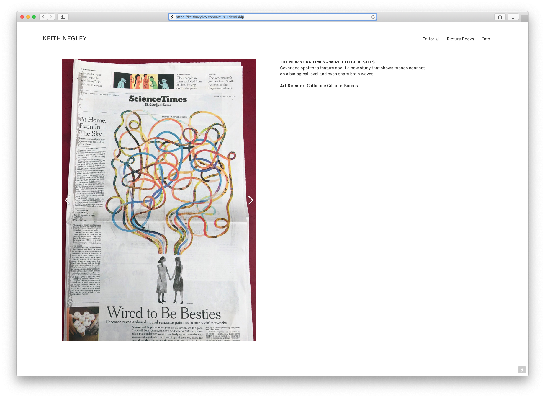
Well documented project galleries
The page that shows the actual full project is what I call the project gallery. This is where you show the full work in a satisfyingly larger format so viewers can really feast their eyes on your art. You should also include a short paragraph stating the purpose and context of the work. Who was the client? What is the image about? Where and how was it used? Who is the art director or other contributors to the work? What unique challenges were you able to creatively solve?

Usually, the illustration itself should be the most prominent image, but in some cases, it is more impressive to focus on how it was used in context. A good example of this would be a mural. If you illustrated a mural on a huge wall, a good photo will speak volumes about the work and make the right impression, and then you can show the digital artwork lower down. That leads me to one other point — include some photos when showing your work. Photos should be well lit and of professional quality. Learn about how to document your physical work with a camera, or hire a photographer to do it for you.

Finally, let’s talk about PSD mockups. In general, most PSD mockups are junk, or at least they are very obviously not real. I’ve seen many a mockup used to make an illustration project look real and legit, but because it’s so clearly a mockup, it has the opposite effect.
If you want to show physical manifestations of your work, like illustrated mugs, beverage bottles, packaging, or printed media, follow this rule of thumb: it should be absolutely necessary to show the physical object for the illustration to make sense to the viewer. In other words, when deciding whether to show the pure artwork (a flat image) versus how the artwork was applied (a photo) show whatever looks best and most impressive. I would add to this that you should only use professionally shot photography. Better to show a clean, flat artwork file than to have a poorly lit, poorly shot photograph. A bad photo of good work will make it look bad, no matter how awesome it looks in person.
To be continued …
Next week, we’ll look at some ways to present yourself and bolster your image. We’ll also talk about what you might do to prove that you’re ready to take on professional work. Meanwhile, I’ll pass some questions over to you: do you have an online portfolio? What platform/host do you use? Why? What has been your experience with them? I look forward to hearing your thoughts.
TF


I’ve been using Tumblr with a paid portfolio theme for the last 2 years, and it’s worked out just fine with a bit of tweaking.
Thanks Chris! Are you satisfied with the level of control you have of the design? Why have you chosen Tumblr over other options?
I’m satisfied with the level of control, yes, because Tumblr lets you edit the template HTML and CSS even on paid themes. I chose Tumblr for the minimalist back end, and the aforementioned theme.
Thanks for this and the other tips on this wonderful site. I hate to admit that I only stumbled across the site yesterday. I can’t wait to fully dive in.
I put my first site together last month on Wix and am surprised I seem to have hit on many of your suggestions. However, I somehow feel my site may be *too* minimal? I’ve only begun doing illustration work for clients in the past couple of years. I have tons more work laying around but it’s all personal work – much of which gets relegated to my Instagram – and so I don’t think it’s relevant to what an AD or agent would like to see. Am I mistaken?
My site is http://www.jorgevelez.art , if curious. Thanks again for the tips and all! Best to you!