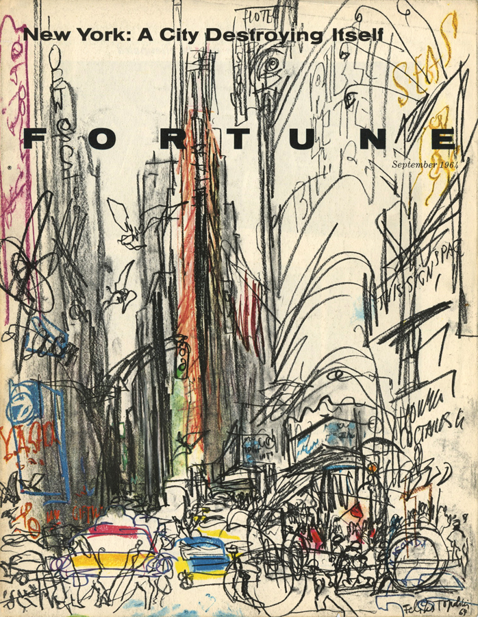
Years ago when I started my search for old issues of Fortune Magazine I was pleasantly surprised to see the type of artwork that they used in each issue. The illustrations were rough, raw, loose and unconventional. At the time, I thought a magazine about business would have a conservative approach to the art that they printed on their pages. I’m glad that I was wrong. The work that I saw in those pages blew my mind.
As I talked about last month one reason why this type of illustration was in Fortune is due to the art direction of Leo Lionni, but credit should also go to the publishers (whose name I unfortunately don’t know). They gave Lionni room to develop his vision and hire the artists that he felt were right for each assignment.
This month I’d like to showcase two series that were done after Leo Lionni left his position as art director of Fortune Magazine. He was no longer the one making decisions, but the two articles that I’ll share below keep in line with the vision he had when he was at the publication.
The first is an article titled “New York: A City Destroying Itself” and is by a Polish artist named Feliks Topolski. From the introduction in that issue: “New York’s frantic rush towards self-destruction is nowhere more evident than in Times Square, sketched for FORTUNE’s cover by Feliks Topolski. Milling mobs of visitor’s gawk at the vulgarities now occupying the square’s once stately buildings and watch the transformation of the Florentine campanile that was Times Tower into a glass, steel, and stone banality called Allied Chemical Tower.”


The other series is by a painter named John Russell Clift and are credited as “Silk-screen prints”. In the magazine is a brief description of his process: “Artist John Clift painted these pictures in the middle of the night, under the floodlights of O’Hare Airport. Nighttime is freight loading time at most airports.”


I’d love to see Fortune, or a similar magazine, push their illustration content and open it up in a way that they did mid-twentieth century. They could hire a non-traditional artist, such as a fine art painter, to do a series. Or like they did with the artists above, send an illustrator to a specific site where they can directly draw at the location. I’m not saying that it’s something they should do every time, but I’d love to see it more often than I do (which is very rare). I think this type of illustration would add excitement to any publication and might even get people talking about it, or in my case writing about it.
Credits:
“New York: A City Destroying Itself”. Fortune Magazine September, 1964
“Big Dogs, Little Dogs, and the Air Cargo Bone”. Fortune Magazine October, 1964.


Thoughts?