

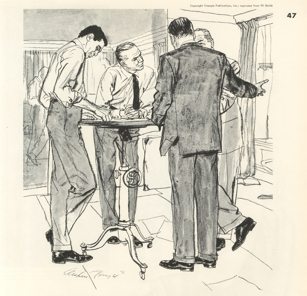
This month I’d like to continue our discussion about Austin Briggs and showcase one of my favorite series: an ad campaign that he illustrated for TV Guide Magazine. The ads ran in more than one publication, most notably in The New Yorker, during the 1950’s and 1960’s. What stands out in this series is his use of textured line and ink wash. He drew each piece using a carbon stick, which has a dark line that can’t be erased, and that forced him to make bold decisions during his mark making process. At times he did use white paint to correct a section, but overall he left the image as it was initially put down on paper. This approach gave the campaign a feeling as though he drew the illustrations directly from life. However, he did this series in his studio using photo reference, models, and props whenever necessary.
Austin Briggs discusses the campaign:
“The people in the advertising series I did for TV Guide are the successes, the powerful people, but I am attempting to be very truthful about them. I have not idealized them in any way. For example, there’s a certain reverse snobbery in their Ivy League look. John Updike recognized what I was trying to do when he said that in my drawings “Madison Avenue personnel were captured in all their dapper fatigue.” Interestingly enough, the more I emphasized these qualities, the more the subjects liked the drawings. I think the artist must be of the people but standing a little aside. True, I feel a real empathy towards these people, but I am not one of them. I don’t view them with any hostility at all. I see them, and myself too, as being made by our environment to a great extent. “
In the Famous Artists Course book from 1960 Briggs shows a step-by-step process of how he created each illustration.

He continues:
“I did not suggest the idea of the TV Guide series. An advertising agency in Philadelphia called me up and said they wanted to do three ads showing advertising people in their native habitat. Perhaps they would be in the office of an agency or on the streets of New York, Chicago, or San Francisco, dressed in what seemed to be their “uniform.” They were to be engaged in conversation. The target of the ads, of course, was the advertising people who bought space in TV Guide. I had never had an assignment that interested me so much, although I have had some fascinating ones.”
“It is the most successful campaign I have ever had anything to do with. Not long ago, I started working on my fortieth TV Guide ad. In the years I have been doing the series, their advertising revenue has gone up every year. A great deal of credit should go to Elmer Pizzi, one of the finest art directors I’ve ever worked for.
If the campaign had been done dishonestly, it would have been just as unsuccessful as all those other campaigns that set out to flatter the advertising industry. I had one ad that showed three people talking in an office. One man was having his shoes shined. He was so engrossed with the problem at hand that he was completely unaware of the shoe shiner at work. Typically, one of the others would probably pay for the service. “
Below is a selection of 20 illustrations from the series.


The quotes by Austin Briggs are from “22 Famous Painters and Illustrators Tell How They Work”.


Features of the rice rubber rolls
http://www.alaskaduraflex.com/Alaska-Rice-Rubber-Roll.html