

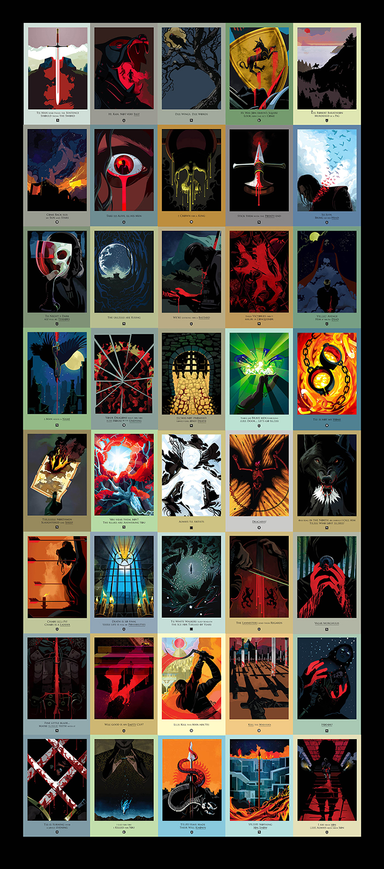
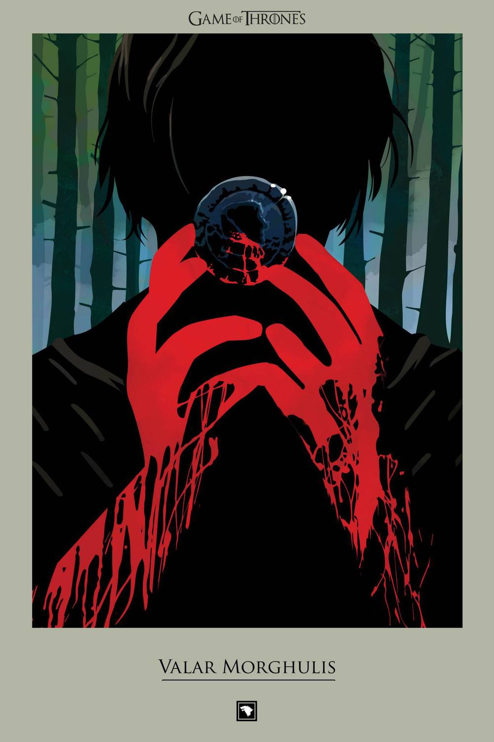
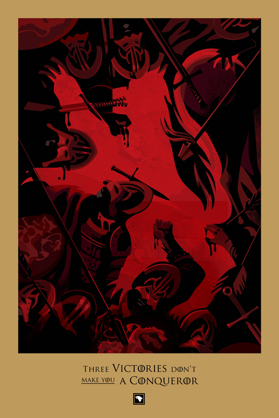
Robert M. Ball, designer and illustrator living and working in London, was commissioned by a digital branding agency in New York – 360i, on behalf of HBO. The idea was to get everyone geared up for Season Four of Game of Thrones by producing some original content that worked as a reminder of the events of the first three seasons. Every day a new illustration would appear on www.beautifuldeath.com, until Season four, when a new illustration would appear a few days after each broadcast.
~
All these illustrations look great and I wondered how he get the job?
Robert M. Ball: “I pitched for the job, the brief was to create an illustration around a death in episode 1, the beheading of a deserter by Ned Stark. I think there’s two reasons not to show the characters too much – to avoid creating another ‘version’ of those characters so you have images that complement the TV series rather than contradict them, to act as a memory jog so the audience remembers the scene, rather than trying to replicate it. Secondly, if you catch an illustration for an episode you haven’t seen yet, by making them slightly oblique the episode won’t be immediately spoiled for you.”
~

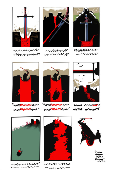
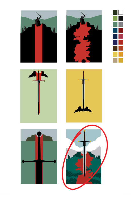
Here you can see the sketchfase of Robert M. Ball, tests for colour combinations and composition.
This is so interesting to see, don’t you think?
Robert M. Ball: “In the case of the sword and the river, those thumbnails were alternatives in my pitch to demonstrate that I had other ideas, to show that I had more than one thought! I would always supply at least two or three ideas per episode, with my preference, which would sometimes be added to by the guys at 360i – it was a very collaborative process.”


Fascinating! Thank you for sharing.
Love his work!! Great share!
Reblogged this on Jen Louise and commented:
I love them!
very nice
Wonderful work. Loved the sketchfase; very interesting!
Glad you like it. I also think it’s interesting to see different stages of an illustration. There’s never only 1 option. :)
Reblogged this on Eyinjay.